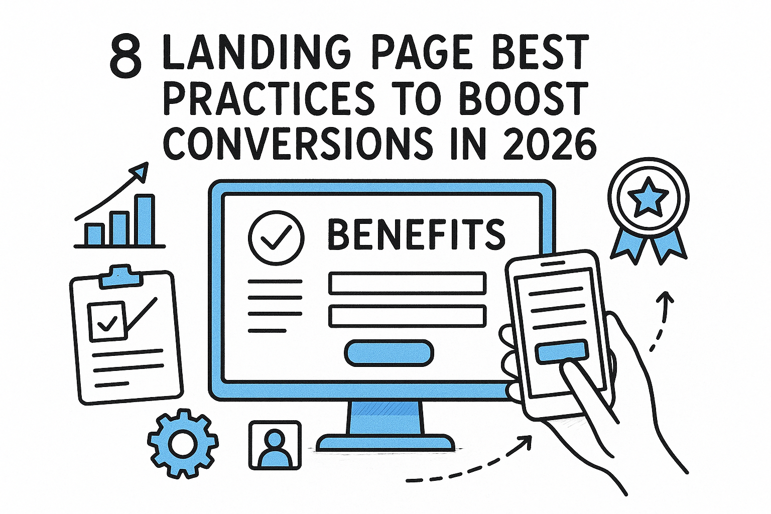
8 Landing Page Best Practices To Boost Conversions In 2026
Categories: Legal Marketing Strategies
 Abram Ninoyan
Founder & Senior Performance Marketer
Credentials: Google Partner, Google Ads Search Certified, Google Ads Display Certified, Google Ads Measurement Certified, Google Analytics (IQ) Certified, HubSpot Inbound Certified, HubSpot Social Media Marketing Certified, Conversion Optimization Certified
Expertise: Google Ads, Meta Ads, Conversion Rate Optimization, GA4 & Google Tag Manager, Lead Generation, Marketing Funnel Optimization, PPC Management
LinkedIn Profile
Most law firm landing pages bleed money because they ignore the basics: a clear offer, a fast load time, and a form people actually want to fill out. Following proven landing page best practices can d...
8 Landing Page Best Practices To Boost Conversions In 2026
Most law firm landing pages bleed money because they ignore the basics: a clear offer, a fast load time, and a form people actually want to fill out. Following proven landing page best practices can double or even triple your conversion rate, and that means more signed cases from the same ad budget.
Here's the uncomfortable math. Unbounce's 2024 Conversion Benchmark Report found that the median landing page converts at just 4.3% across industries. Legal pages often perform worse, especially on mobile, where generic contact forms drop conversion rates from 4–6% down to 1–2%. Every percentage point you recover translates directly into revenue, without spending another dollar on Google Ads.
At GavelGrow, we've built and tested intake pages across 500+ U.S. law firms, and the patterns are clear. The firms that consistently turn clicks into consultations follow a short list of principles that most agencies skip. This article breaks down eight landing page best practices that actually move the needle in 2026, pulled from real campaign data rather than recycled marketing theory.
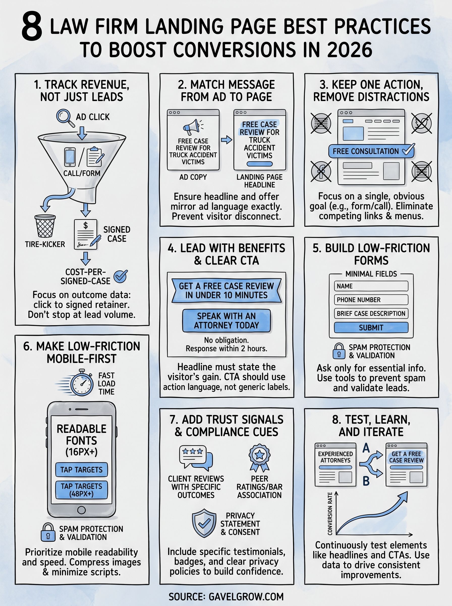
1. Track revenue, not just leads
Most firms set up Google Ads, point traffic at a landing page, and celebrate when the phone rings. That approach tells you almost nothing useful. Lead volume without outcome data means you cannot tell which campaigns produce signed retainers and which produce tire-kickers. One of the most overlooked landing page best practices is building revenue tracking before you optimize anything else.
What to track from click to signed customer
Every conversion event on your page needs to carry data forward, not just fire a pixel and disappear. You want to track the originating keyword or campaign, the form submission or call, the intake outcome, and ultimately whether that prospect signed a retainer. When those events are stitched together, you can calculate a true cost-per-signed-case for each landing page variant, not just a cost-per-click.
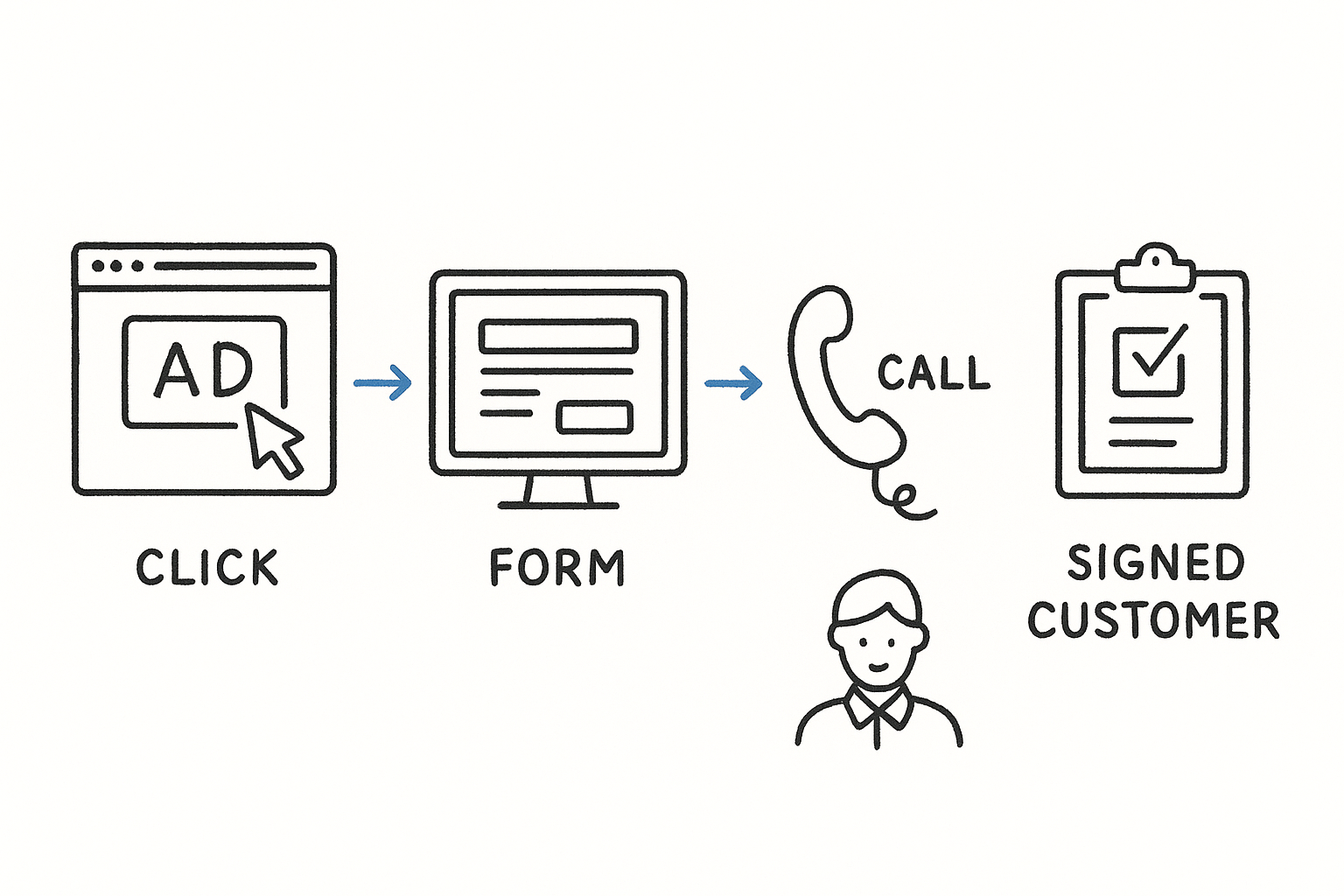
Cost-per-lead is a vanity metric unless you know what percentage of those leads actually become paying clients.
A basic attribution chain looks like this:
- Ad click tagged with UTM parameters
- Form submission or call captured with the same campaign source
- Lead record linked to an intake outcome (qualified, callback, unqualified)
- Signed case tied back to the originating lead and campaign
How GavelGrow connects ads, calls, forms, and outcomes
GavelGrow's platform handles this attribution chain natively. Per-campaign call tracking numbers (built on Twilio) record every inbound call, tag it to the originating campaign, and let you mark the outcome. Intake forms fire GA4, Meta Pixel, and GTM events simultaneously with a transaction ID so you never double-count conversions across ad platforms. Every lead row in the pipeline shows its source campaign and CPL inline, so you see exactly where your signed cases originate.
How to set up reporting that stakeholders trust
Build a single dashboard that shows spend, leads, qualified rate, and signed cases side by side. Stakeholders lose confidence in marketing reports when the numbers live in three separate tools that never agree. Pull campaign spend from Google Ads sync, calls from your tracking numbers, and case outcomes from your intake pipeline into one view. Weekly reporting at the campaign level gives you enough data to make decisions without waiting for a monthly review cycle that is already too late to act on.
2. Match message from ad to page
When someone clicks your ad, they arrive with a specific expectation. If your landing page headline does not match what the ad promised, they leave. This disconnect is one of the most common reasons landing page best practices get ignored in execution: firms spend heavily on ads but skip the step of aligning the page copy to the ad copy.
How to ensure headline and offer align with the click
Your landing page headline should mirror the exact language in the ad that drove the click, not just the general topic. If your ad says "Free Case Review for Truck Accident Victims," your headline should say the same thing, not "Experienced Personal Injury Attorneys." The offer and tone should carry through from ad to page without forcing the visitor to reorient.
Visitors decide in under 3 seconds whether a page matches what they expected when they clicked.
How to handle multiple keywords and audiences
Running ads across several practice areas or keyword groups means a single landing page will rarely serve all of them equally well. Build dedicated pages for your highest-spend audiences rather than routing everyone to a generic page. A page targeting "DUI attorney free consultation" should speak directly to that situation, not to criminal defense broadly.
How to spot message-mismatch in analytics
Check your bounce rate and average session duration by campaign in Google Analytics. A high bounce rate on traffic from a specific ad group almost always signals that the ad promise and page delivery do not line up. Fix the weakest match first, since that is where you recover the most conversions quickly.
3. Keep one action and remove distractions
Every extra option you give a visitor is a chance for them to do nothing. One of the most consistent landing page best practices is reducing your page to a single, obvious conversion goal and cutting everything else that competes for attention.
How to choose a single conversion goal per page
Pick one primary action before you write a single word of copy. For most law firms, that means either a form submission for a free consultation or a direct phone call. Trying to accomplish both on the same page often results in neither.
A page with two calls to action converts at roughly half the rate of a page built around one.
What to remove or de-emphasize to prevent leaks
Navigation menus, social media links, and unrelated blog posts all pull visitors away from the conversion you want. Remove the main site navigation entirely from your landing page. Secondary links like "About Us" or "Our Team" belong on your main website, not on a page designed to generate leads.
How to design the page flow to the CTA
Structure your page so every section points toward the form or phone number. Use a visual hierarchy that moves from headline to benefits to proof to CTA without detours. Short paragraphs, clear subheadings, and whitespace guide the eye downward and reduce the cognitive load that causes visitors to abandon before they act.
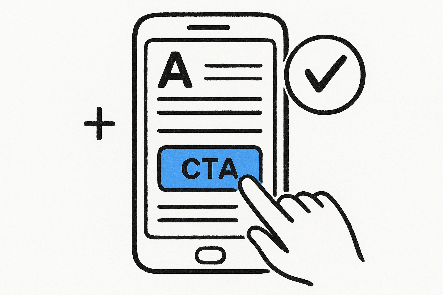
4. Lead with benefits and clear CTA
Visitors do not read landing pages the way they read articles. They scan quickly for what's in it for them, and if that answer is not obvious in the first few seconds, they leave. Applying this landing page best practice means putting your strongest benefit in the headline and your CTA where no one can miss it.
How to write a benefit-first headline that stays specific
Your headline should answer one question: what does the visitor gain by staying on this page? "Experienced attorneys ready to help" is vague. "Get a free case review in under 10 minutes" is specific and gives the visitor a concrete reason to act. Specificity builds credibility in a way that generic claims never will.
The more specific your benefit, the more trust it earns before the visitor reads another word.
How to build a CTA that reduces uncertainty
A weak CTA creates hesitation. Instead of "Submit," use action language that confirms what happens next, such as "Get My Free Consultation" or "Speak With an Attorney Today." Pair your CTA button with a single line of reassurance copy directly below it, like "No obligation. Response within 2 hours."
How to use page structure to make copy scannable
Break your copy into short blocks with clear subheadings so visitors who scan rather than read can still absorb your key points. Put your primary CTA above the fold and repeat it at the bottom of the page so no one has to scroll back up to take action.
5. Build low-friction forms
Your form is the final gate between a visitor and a signed client. If it asks too much too soon, people abandon it. Reducing form friction is one of the most impactful landing page best practices you can apply without touching your ad budget.
How to decide what fields to ask for and when
Start with only the fields you absolutely need to qualify the lead. For most law firms, that means name, phone number, and a brief case description. Every additional field you add drops form completion rates. If you need more detail, collect it during the intake call rather than on the form.
The fewer decisions a visitor has to make on your form, the more likely they are to finish it.
When to use multi-step forms vs single-step forms
Multi-step forms work better when you need more qualifying information without overwhelming the visitor upfront. Breaking a form into two or three short steps keeps each screen simple and gives the visitor a sense of forward progress. Single-step forms work well for high-intent traffic where the visitor has already decided to reach out and just needs a low-effort way to do it.
How to prevent spam and improve lead quality
Spam submissions waste your team's time and distort your conversion data. GavelGrow's intake forms use invisible Cloudflare Turnstile bot protection and carrier-level phone validation via Twilio Lookup, so every submission that reaches your pipeline is a real person with a real phone number. Built-in 10-minute duplicate detection also prevents the same lead from clogging your queue multiple times.
6. Make it fast and mobile-first
Speed and mobile layout are not optional in 2026. Google's mobile-first indexing means your page's mobile version determines how it ranks, and a slow page loses conversions before a visitor reads a word. This is one of the most direct landing page best practices you can implement without changing your ad budget.
Google data shows that as page load time increases from 1 to 3 seconds, the probability of bouncing increases by 32%.
What to prioritize for mobile readability and taps
Your mobile page needs large, readable fonts (at minimum 16px body text) and tap targets at least 48px tall so forms and buttons work reliably on small screens. Prioritize these three layout choices:
- Stack content vertically so visitors scroll, not zoom
- Keep your primary CTA visible above the fold
- Use sufficient contrast so text is readable in direct sunlight
How to reduce load time without stripping clarity
Compress every image and serve files in modern formats like WebP. Remove non-essential third-party scripts, including chat widgets and social embeds, that delay your page without helping visitors convert. Your goal is to load the above-the-fold content first so visitors see something useful before the rest of the page finishes rendering.
What to check with Core Web Vitals and real devices
Run your page through Google PageSpeed Insights to review your Largest Contentful Paint and Cumulative Layout Shift scores. Also test on a real mid-range device on a mobile connection, because emulator results often look cleaner than what actual visitors experience on a standard network.
7. Add trust signals and compliance cues
Visitors who land on your page for the first time have no reason to trust you yet. Trust signals and compliance cues reduce that hesitation and give prospects the confidence to submit a form or call your office. Skipping this step is one of the most common gaps in landing page best practices, especially for law firms where choosing the wrong attorney feels like a high-stakes decision.
Which trust signals reduce hesitation without clutter
Place client reviews with specific outcomes near your form where they matter most. A testimonial that says "They recovered $180,000 for my accident claim" works harder than any generic compliment. Keep trust signals focused on two or three high-impact elements:
- Outcome-specific client testimonials with names
- Bar association badges or peer ratings
- Case result figures relevant to the practice area
One well-placed, outcome-specific testimonial near your CTA can lift form completions more than a full page redesign.
How to handle privacy, consent, and legal disclaimers
Your form needs a clear privacy statement directly below the submit button explaining how you handle personal data. For SMS opt-in, include TCPA-compliant consent language that names the message types and explains how to opt out. Plain-language text works better than legal boilerplate that visitors skip entirely.
How to design for accessibility and clarity
Use sufficient color contrast (at minimum a 4.5:1 ratio per WCAG 2.1 guidelines) so your text remains readable for all visitors. Descriptive form labels placed above each input field reduce errors and prevent abandoned submissions before the lead ever reaches your pipeline.
8. Test, learn, and iterate
Even the strongest landing page best practices give you a starting point, not a finished product. Every assumption you make about what your visitors want needs to eventually face real traffic data. Testing is what separates firms that continuously improve their conversion rates from those that launch a page and leave it untouched for two years.
What to test first for the biggest conversion lift
Start with the elements that have the largest impact on whether someone converts: your headline and primary CTA button. A headline change alone can shift conversion rates by double digits. Test one element at a time so you know exactly what moved the needle.
How to run clean A/B tests and avoid false winners
Run each test until you reach statistical significance (typically at least 95% confidence) before declaring a winner. Stopping early because one variant looks better is one of the most common testing mistakes firms make.
Calling a winner too early is the fastest way to make a change that actually hurts your conversion rate.
Use Google's Optimize successor tools or your ad platform's built-in split-testing features to divide traffic evenly between variants so your results are clean and attributable.
How to build a monthly landing page optimization routine
Set aside one dedicated session per month to review your top-traffic landing pages. Check Core Web Vitals, form completion rates, and bounce rates by traffic source, then prioritize your next test based on which metric shows the most room for improvement. Treat each iteration as a step forward rather than a verdict on your page, because small, consistent improvements compound into significantly better conversion rates over a full year of testing.
Next Steps
These eight landing page best practices give you a clear starting point, but reading them is not the same as applying them. The biggest gains come from picking one principle, implementing it this week, and measuring the result before moving to the next. Start with message match or form friction, since those two changes alone recover the most lost conversions for law firms running paid traffic.
If you want to see how your current intake pages and lead tracking stack up against 500+ peer firms, GavelGrow's free marketing scorecard surfaces the gaps in under five minutes. Or, if you would rather have a strategist walk through your specific setup and ad spend, book a free 45-minute strategy call with the GavelGrow team and come away with a concrete action plan tailored to your practice area and market.