How to Improve Website Conversion Rates for Your Law Firm
Categories: Guide: How-to
 Abram Ninoyan
Founder & Senior Performance Marketer
Credentials: Google Partner, Google Ads Search Certified, Google Ads Display Certified, Google Ads Measurement Certified, Google Analytics (IQ) Certified, HubSpot Inbound Certified, HubSpot Social Media Marketing Certified, Conversion Optimization Certified
Expertise: Google Ads, Meta Ads, Conversion Rate Optimization, GA4 & Google Tag Manager, Lead Generation, Marketing Funnel Optimization, PPC Management
LinkedIn Profile
Boosting your law firm’s website conversion rate isn’t about flashy design—it’s about building trust and guiding potential clients toward action.
Boosting your law firm’s website conversion rate isn't just about tweaking a few buttons. It's a fundamental shift in thinking—moving from simply attracting visitors to actively guiding them toward a consultation. The entire process starts by sharpening your message, making your user's journey dead simple, and placing powerful calls-to-action that speak directly to their urgent needs.
In the end, it’s all about turning a passive browser into a qualified lead for your practice.
Why High Traffic Is Not Enough for Law Firms
I’ve heard this from countless managing partners: "Our SEO and paid ads are bringing thousands of people to the site, but the phone isn't ringing." They see the traffic reports and think they're winning, but their case pipeline is bone dry. This is a classic disconnect. Traffic volume is a vanity metric; it doesn't pay the bills. The true measure of your website’s success is its ability to turn those visitors into actual clients for your firm.
So why do potential clients leave? It's usually for a few predictable reasons. They get confused by vague messaging that doesn't immediately tell them, "Yes, this is the right attorney for my specific problem." Or maybe they can't find critical information, like your bio or past case results, because the site navigation is a maze.
More often than not, they simply aren't told what to do next.
Moving From Clicks to Clients
Optimizing for conversions is really about building immediate trust and creating a frictionless path from initial interest to taking action. Every single element on your site—from the homepage headline to the color of your "Contact Us" button—either helps or hurts that goal.
Even the behind-the-scenes technical stuff plays a huge part. For instance, slow page speed is a silent killer of leads. It's one of the most critical factors influencing whether a visitor sticks around. The data is clear: websites that load in just one second can see conversion rates up to five times higher than sites that take five seconds to load. A faster site feels more professional and keeps anxious visitors engaged. You can dig into more data on how speed impacts conversions over at WordStream.
This image breaks down some of the core metrics behind what makes a law firm website perform.
As you can see, even small, consistent improvements can lift your conversion rate far above the industry average. It's how you turn your existing traffic into a powerful engine for growth. This guide is all about giving you the practical, results-focused steps to make that happen.
Quick-Scan Conversion Checklist for Law Firm Websites
Before we dive deeper, it helps to have a high-level view of the non-negotiables. Think of this table as a quick diagnostic tool for your own site. If you're missing any of these core components, you're almost certainly leaving clients on the table.
Essential Element
Why It's Critical for Law Firms
Direct Impact on Lead Generation
Clear Value Proposition
Instantly answers "Am I in the right place?" and "Can they solve my problem?"
Reduces bounce rate and keeps relevant visitors engaged.
Visible Contact Information
Anxious clients need to know they can reach you easily via phone, form, or chat.
Makes it frictionless for a user to take the next step.
Social Proof (Testimonials/Reviews)
Builds immediate trust and credibility, which is vital for legal services.
Overcomes skepticism and encourages prospects to contact you.
Mobile-First Design
Over 60% of legal searches happen on mobile devices. A bad mobile experience is a deal-breaker.
Captures the majority of your potential clients where they are searching.
Strong Calls-to-Action (CTAs)
Clearly tells the visitor what to do next (e.g., "Schedule a Free Consultation").
Moves visitors from passively browsing to actively engaging.
Fast Page Load Speed
A slow site feels unprofessional and frustrating, causing users to abandon the page.
Improves user experience and directly correlates with higher conversion rates.
Having these fundamentals locked in is the foundation of a high-converting website. From here, we can start refining the details.
Build Credibility and Trust From the First Click
Let's be honest. Before a potential client ever considers telling you the sensitive details of their legal problem, they need to believe you can actually help them. High website traffic is a great vanity metric, but it means absolutely nothing if your site doesn't immediately signal expertise and integrity. This is where you stop just listing services and start building a real case for why your firm is the right choice.
Think about it from their perspective. For someone in distress, your website is the first handshake. It needs to feel firm, confident, and professional. We can achieve this by applying modern law firm website design principles that are proven to turn skeptical visitors into new clients.
A polished, well-designed site isn't just about looking good—it's a critical trust signal. It tells visitors your firm is successful, pays attention to detail, and is serious about its work.
Put a Face to the Firm
Anonymous websites don't build confidence. People hire people, not faceless entities. Your potential clients want to see who will be fighting for them.
Your attorney bio pages are some of the most valuable real estate on your entire website. They need to do more than just rehash a resume; they need to tell a story that connects with the person reading it.
- Professional Headshots: This is non-negotiable. Invest in high-quality, consistent photos. A warm, confident smile can build an instant human connection before a single word is read.
- Experience That Matters: Don't just list bar admissions. Talk about specific, relevant experience. Did you win a major trial? Close a series of complex M&A deals? Spell it out.
- A Personal Touch: Including a brief mention of an attorney's community involvement or a personal interest can make them far more relatable and approachable.
These touches transform a dry list of credentials into a compelling profile of a trusted advisor.
Show, Don't Just Tell, with Social Proof
Anyone can say they're the best. Proving it is what actually gets the phone to ring. Social proof is the hard evidence that backs up your claims and gives potential clients the confidence they need to take the next step.
Your digital reputation is a core business asset, and actively managing it is essential. That's why a smart approach to lawyer reputation management is so critical for growth.
A personal injury firm that features a $2.5 million settlement for a car accident victim isn't just bragging. They're demonstrating a proven ability to handle high-stakes cases and deliver life-changing results.
You need to place these powerful trust signals where they can't be missed. Weave them throughout your site.
- Real Client Testimonials: Use actual quotes from happy clients. Adding their name and a photo makes the testimonial exponentially more credible. If you can get video testimonials, even better.
- Verifiable Case Results: Always present case results ethically and within your state bar's advertising rules. Frame them as proof of what your firm can accomplish.
- Awards and Recognitions: If you have badges from Super Lawyers, Best Lawyers, or Martindale-Hubbell, display them proudly. These third-party endorsements are instant credibility boosters.
At GavelGrow, we know that a high-converting website for a law firm is built on a foundation of trust. We strategically integrate these elements into every site we design, ensuring that from the moment a visitor lands on your page, they see your firm as an authoritative and expert choice.
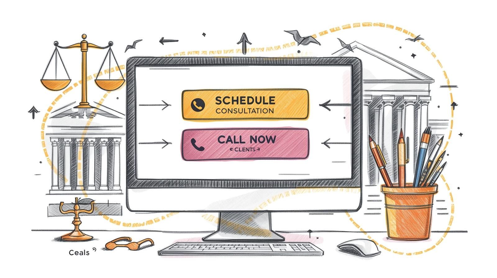
Designing Calls-to-Action That Actually Generate Consultations
So, a potential client lands on your site. They're impressed, they see your expertise, but then... what happens next? If you don't give them a crystal-clear next step, they're gone. Maybe forever. Simply having a "Contact Us" page isn't enough; you need to actively guide visitors toward becoming clients. Your calls-to-action (CTAs) are the key, and they need to be specific, persuasive, and impossible to ignore.
Forget generic CTAs like “Learn More.” They’re weak because they don’t convey any urgency or clear direction. Someone facing a stressful legal issue isn't looking for a research project; they need a solution. Your job is to make connecting with you the most logical, obvious next move.
Speak Directly to Your Ideal Client
The best CTAs are custom-built for the specific anxieties and goals of clients in your practice area. They offer something tangible and set clear expectations right from the start.
Here's what we mean:
- Estate Planning Firm: Instead of a generic "Contact Us," try "Download Your Free Estate Planning Checklist." This provides immediate value. You're not asking for anything yet; you're giving them a helpful tool, which positions you as a trusted advisor from the first click.
- Criminal Defense Firm: Use language like "Request a Confidential Case Review." That word, "confidential," is everything. It directly addresses a major fear and starts building trust before you've even spoken.
- Corporate Law Firm: A CTA like "Book a Strategic M&A Consultation" is perfect. It speaks the language of a business-minded audience and frames the conversation around high-value, strategic outcomes, not just legal services.
See the pattern? These aren't just buttons; they're direct answers to a visitor's problem. Once you've captured their info with these initial offers, you can begin the process of guiding them toward a consultation. If you want to dive deeper into that follow-up process, check out our guide on lead nurturing best practices for law firms.
Make Your CTA Impossible to Miss
What your CTA says is only half the battle. Where you put it and what it looks like are just as important. Don't make the mistake of burying your most important action item at the bottom of a page.
Your primary CTA needs to be unmissable. It should be "above the fold"—meaning visible without any scrolling—on your homepage and every single one of your practice area pages. A potential client should never have to search for how to get in touch.
Design is also a huge factor here. Use a high-contrast color for your CTA button that makes it pop from your site’s color palette. For example, if your website is built on a foundation of professional blues and grays, a vibrant orange or green button will instantly draw the eye.
And always, always start the button text with a strong action verb. "Schedule," "Download," or "Request" create a psychological nudge that encourages a direct response.
Analyzing Your Traffic: The Real Key to Higher Conversions
Let's be honest: not all website visitors are created equal. You can get a flood of traffic that looks great in your analytics reports, but if it doesn't translate into actual cases, it's just a vanity metric. The secret to really moving the needle on your conversion rates isn't just about getting more traffic—it's about getting the right traffic.
Think about it. A potential client who finds you by searching for a highly specific phrase like "lead generation for IP lawyers" is light-years ahead of someone who casually clicks a link on social media. That search query signals a real, immediate need. They have a problem and are actively looking for someone to solve it.
This is where you have to shift your mindset. Stop chasing raw numbers and start focusing on attracting visitors who are genuinely ready to take the next step.
High-Intent vs. Low-Intent: Knowing Who's Knocking at Your Door
You have to get inside the head of the person visiting your site. High-intent traffic comes from people who are on a mission. They're not just browsing; they're actively looking for legal help. Low-intent traffic is more passive, often driven by curiosity or a fleeting interest.
Putting your energy and budget into high-intent sources is the fastest way to get more qualified leads.
- Direct Traffic: This is the gold standard. These are people who type your firm’s URL directly into their browser. More often than not, they were referred by a happy client or a colleague. They already trust you.
- Paid Search Traffic: When someone clicks on your Google Ad after searching for something specific, their intent is crystal clear. A well-run campaign targeting a term like "local SEO for family law practices" captures people in their moment of need.
- Organic Search (Long-Tail Keywords): This is where your SEO efforts really shine. Ranking for a specific phrase like "what to do after a truck accident in houston" brings in people who are past the initial research stage and are likely looking to hire.
On the flip side, traffic from a broad social media blast or a generic display ad campaign tends to have much lower conversion potential. The user's intent just isn't as strong.
Put Your Money Where the Clicks Count
The data doesn't lie—some traffic sources are simply better at converting than others. Direct traffic, fueled by referrals and reputation, often has the highest conversion rate. Paid search isn't far behind, thanks to its laser-focused targeting.
In fact, research shows direct traffic in the legal space converts at an impressive 4.2%. Paid search follows closely at 3.2%. Compare that to organic search (2.3%) and paid social media (1.6%), and the picture becomes very clear. You can dig into more benchmarks on website visitor visitor conversion rates to see how different channels stack up.
The big takeaway here is simple: your marketing budget should heavily favor the channels that actually deliver signed clients, not just empty clicks. To do that, you have to know precisely where your best leads are coming from.
This is exactly why having a rock-solid tracking system is non-negotiable for any law firm that's serious about growth. You need to be able to trace a new client all the way back to the specific campaign, keyword, or channel that brought them to you. It's the only way to make smart decisions and stop wasting money. We take a much deeper dive into this in our guide on what is marketing attribution.
By carefully analyzing your traffic, you can start refining your Google Ads for lawyers to attract better-quality clicks and fine-tune your law firm SEO services to capture those high-value prospects. It’s a strategic shift that ensures every marketing dollar you spend is working hard to grow your firm.
Creating a Frictionless User Experience for Clients
A confusing website is the fastest way to lose a potential client. Seriously. If someone lands on your site and can't immediately figure out where to go or what to do, they’re gone. They'll just click back and head straight to a competitor. That’s why creating a frictionless user experience (UX) isn't just a nice-to-have; it's a fundamental part of turning website visitors into actual clients.
Put yourself in their shoes for a minute. Most people searching for a lawyer are already dealing with a stressful situation, and there's a good chance they're doing it from their phone. They don't have the time or patience to solve a digital puzzle. Your website needs to be the clear, simple solution, not another source of frustration.
Prioritize Mobile-First Design
We can't stress this enough: your website has to work perfectly on a smartphone. A huge chunk of legal searches happen on mobile devices, making a clunky mobile experience a massive liability.
Think about the basics. Are the buttons big enough to tap easily with a thumb? Is the text readable without having to pinch and zoom? Can a visitor find your phone number and practice areas with a quick scroll? This mobile-first mindset is non-negotiable if you want to improve your conversion rates, because you’re meeting the majority of your audience right where they are.
Simplify Your User's Journey
Every single click you force a visitor to make is another chance for them to give up and leave. Your job is to create a dead-simple, intuitive path from the moment they land on your homepage to the moment they pick up the phone or fill out your form.
For a deep dive into mapping this out, check out this complete guide to customer journey optimization. It’s a great resource for minimizing drop-offs.
Here are the absolute essentials for a simple, high-converting journey on a law firm site:
- Simplified Navigation: Keep your main menu clean and obvious. Stick to clear labels like "Practice Areas," "Our Attorneys," and "Contact Us." Getting creative here only causes confusion.
- Click-to-Call Numbers: This is a small detail with a huge impact. Every phone number on your site must be a clickable link. It removes a major barrier for mobile users who are ready to call you on the spot.
- Short, Simple Forms: Nobody wants to fill out a 15-field questionnaire. All you really need to start a conversation is a name, email, phone number, and a short message box. A streamlined form dramatically reduces friction and is a key part of our recommendations for client onboarding best practices.
A seamless website experience does more than just make things easy. It communicates professionalism and a deep respect for a visitor's time, building trust long before the first phone call.
This principle of reducing friction isn't unique to law. Just look at the e-commerce world. Recent analysis shows their website conversion rates have climbed to nearly 3% globally, largely because they’ve perfected mobile checkout and personalized the user journey. The lesson is universal: making it easier for people to take action pays off every time.
Answering Your Law Firm's Top Conversion Questions
Over the years, we've had countless conversations with partners and marketing directors about boosting their website's performance. The same handful of practical, bottom-line questions always seem to pop up. These are the concerns that really matter when you're deciding where to put your time and money.
Let’s cut through the noise and get straight to the answers.
What’s a "Good" Conversion Rate for a Law Firm Website?
Everyone wants to know the magic number. While it can shift depending on your practice area and where your traffic is coming from, a solid target for most law firm websites is a conversion rate between 2% and 5%. If you're hitting that range, you’re generally in good shape.
Of course, context is everything. Traffic from a hyper-specific campaign, say for "marketing for criminal defense law firms," should convert on the higher end of that scale. In contrast, broader organic traffic from someone just starting their research will naturally be closer to that 2-3% mark.
The key is to benchmark against yourself first and focus on steady improvement. But if your site is converting below 1%, that's a major red flag. It tells you there's a serious problem with your site's user experience, trust signals, or calls-to-action that needs to be fixed, pronto.
How Quickly Can I Actually See Results?
This is the great thing about conversion optimization—you can see the impact surprisingly fast. It’s not like SEO, where you’re playing the long game. With CRO, you get feedback from your audience almost immediately.
Simple tweaks can make a real difference in a matter of weeks. We've seen things like rewriting a confusing homepage headline or just changing a CTA button color to something that pops lead to a measurable lift in calls and form submissions.
Bigger changes, like overhauling a practice area page or launching a new downloadable guide, will take a bit longer. You'll likely need one to three months to collect enough data to know for sure how well it's working.
Should We Focus on More Traffic or Better Conversions First?
This is a no-brainer for us: focus on conversions first, every single time. It's just a matter of efficiency and getting a better return on your marketing spend.
Think of it this way: if your website only converts 0.5% of visitors, doubling your traffic just means you're burning through your budget twice as fast. But if you first get that site converting at 3%, every dollar you spend on ads or SEO from that point on becomes six times more effective.
You have to fix the leaky bucket before you pour more water into it. Optimizing your website first ensures you’re getting the most value out of the traffic you already have and sets you up for success with any future marketing investment.
What's the Single Biggest Change We Can Make for More Leads?
If we had to pick just one thing, it would be this: put a clear, compelling, and impossible-to-miss call-to-action (CTA) "above the fold" on your homepage and all of your main service pages. That means a visitor sees it instantly, without having to scroll.
Don't be subtle. Make it dead simple for a potential client to know what you want them to do next. Whether it's "Schedule a Free Consultation" or "Call Us Now," use action-focused words. Put it on a button with a color that contrasts with the rest of your site’s design. This one change cuts through the confusion, gives people a clear path forward, and will directly increase your leads.
Ready to stop guessing and start converting? The team at GavelGrow builds conversion-optimized websites and funnels designed specifically for law firms. Book a no-obligation strategy session with us today to discover how we can turn your website into your most reliable client acquisition tool.