6 Law Firm Website Design Tips for Attracting More Clients
Categories: Legal Marketing Strategies
 Abram Ninoyan
Founder & Senior Performance Marketer
Credentials: Google Partner, Google Ads Search Certified, Google Ads Display Certified, Google Ads Measurement Certified, Google Analytics (IQ) Certified, HubSpot Inbound Certified, HubSpot Social Media Marketing Certified, Conversion Optimization Certified
Expertise: Google Ads, Meta Ads, Conversion Rate Optimization, GA4 & Google Tag Manager, Lead Generation, Marketing Funnel Optimization, PPC Management
LinkedIn Profile
The most useful law firm website design tips come down to six changes. Give the first screen a clear message, design for phones first, show credibility within your bar's rules, organize navigation aro...
Key Takeaways
- 6 Law Firm Website Design Tips for Attracting More Clients
- 1. Lead with a first screen that answers three questions
- 2. Design for phones before desktops
- 3. How do you show credibility within state bar rules?
6 Law Firm Website Design Tips for Attracting More Clients
The most useful law firm website design tips come down to six changes. Give the first screen a clear message, design for phones first, show credibility within your bar's rules, organize navigation around practice areas, keep your intake form short, and make the site fast and accessible. A referral-driven firm can start with credibility and navigation. A firm that pays for ads should start with the first screen, mobile layout and intake form.
A person with a legal problem is not browsing for fun. Even when someone is referred to you, they check your website before they call, and they decide in a few seconds whether you handle their matter and how to reach you. Decorative design, vague headlines and long forms lose those visitors to the next firm in the results.
This article walks through six tips in priority order. Each one covers what to do and the mistake to avoid. GavelGrow has marketed only for law firms since 2015, so the focus is on what happens after the click: a site that produces a call or a form your intake team can follow all the way to a signed retainer.
Key Takeaways
- What matters most? A first screen with your practice area and a tap-to-call number.
- Should you design for phones first? Yes, calling and form completion must be easy on mobile.
- Can you show testimonials? Only within your state bar's advertising rules.
- How long should an intake form be? Ask only what you need to call back.
- How fast should the site load? Aim for Google's "good" Core Web Vitals ranges.
1. Lead with a first screen that answers three questions
Your first screen should tell a visitor what you handle, who you help, and how to reach you, all without scrolling. If a visitor has to hunt for any of the three, many will leave before they find them. Treat this tip as the foundation, because every other page inherits its job from the homepage.
What to do
Write the headline for the person you want to hear from, not for the firm. "Divorce and custody representation for parents who need a clear plan" tells a visitor more than your firm name does. Then add the few elements that move them to act.
- One headline that names the practice area and the client you serve.
- One primary call to action, such as a click-to-call phone number or a consultation request, repeated in the header.
- One proof element near the top, such as bar admissions or years in practice.
- A real photo of your attorneys instead of a stock handshake.
Mistake to avoid
The most common failure is a homepage that opens with "Welcome to our firm" and a rotating slider. A slider hides messages behind a timer, and a welcome line says nothing about what you do. Visitors scan, so each slide competes with the others and none gets read.
Test your own page by covering everything except the top screen and asking a colleague what you do and how to call you. If they hesitate, rewrite the headline before touching any other design element.
A visitor should know what you handle and how to reach you before they scroll.
2. Design for phones before desktops
Build the mobile layout first, because people in a legal emergency often search and call from a phone. A desktop design shrunk to fit a small screen usually buries the phone number and makes forms painful. You do not need an exact percentage to act on this. Open your analytics, check how many visitors arrive on mobile, and let your own number decide the priority.

What to do
Start from the smallest screen and add elements as the screen grows. Responsive design handles the layout, but you decide what a phone visitor sees first.
- Add a sticky tap-to-call button that stays visible while the visitor scrolls.
- Set body text at 16 pixels or larger, with enough line spacing to read without zooming.
- Make buttons and links large enough to tap, roughly 44 to 48 pixels, with space between them.
- Use the right input types so a phone field opens the number keypad.
- Break long forms into steps rather than one tall column of fields.
Mistake to avoid
Pop-ups and chat widgets often cover the call button on a small screen. A hamburger menu that hides the phone number is another common problem. Both put a barrier between a worried visitor and the one action you want.
Pick up your own phone, open your homepage, and try to call the firm one-handed in under ten seconds. Contact forms generally perform worse on mobile than on desktop, so any friction you find is costing you inquiries.
If a visitor cannot call you in two taps from a phone, the design is failing.
3. How do you show credibility within state bar rules?
Show credibility through specific, checkable facts, and leave out superlatives and promises of results. Real attorney profiles, bar admissions, years in practice and the matter types you handle build trust. Rules on testimonials, past results and claims of superiority vary by state. Check your own state bar's advertising rules before you publish anything. ABA Model Rule 7.1 bars false or misleading communications about a lawyer's services, and states adopt their own versions.
What to do
Credibility on a law firm site is mostly about people. Visitors want to know who will handle their matter before they call.
- Give each attorney a profile with a recent professional headshot, a medium-length bio, bar admissions and a contact route. A full CV can be linked separately.
- Add an About page covering the firm's history, values and community involvement.
- Display reviews or testimonials only where your state's rules allow, with any required disclaimers.
- Publish disclaimers that say what does and does not create an attorney-client relationship, plus a privacy policy that explains how you use form data.
Mistake to avoid
Avoid words like "best," "top" or "guaranteed," and avoid listing case results without the context and disclaimers your state requires. These are the claims regulators look at first.
If you show Google reviews, ask every client for a review the same way and respond professionally to each one, good or bad. Selectively asking happy clients or offering incentives violates Google's review policies and can put your Business Profile at risk.
Specific facts about your attorneys build more trust than any claim of superiority.
4. Build navigation around practice areas
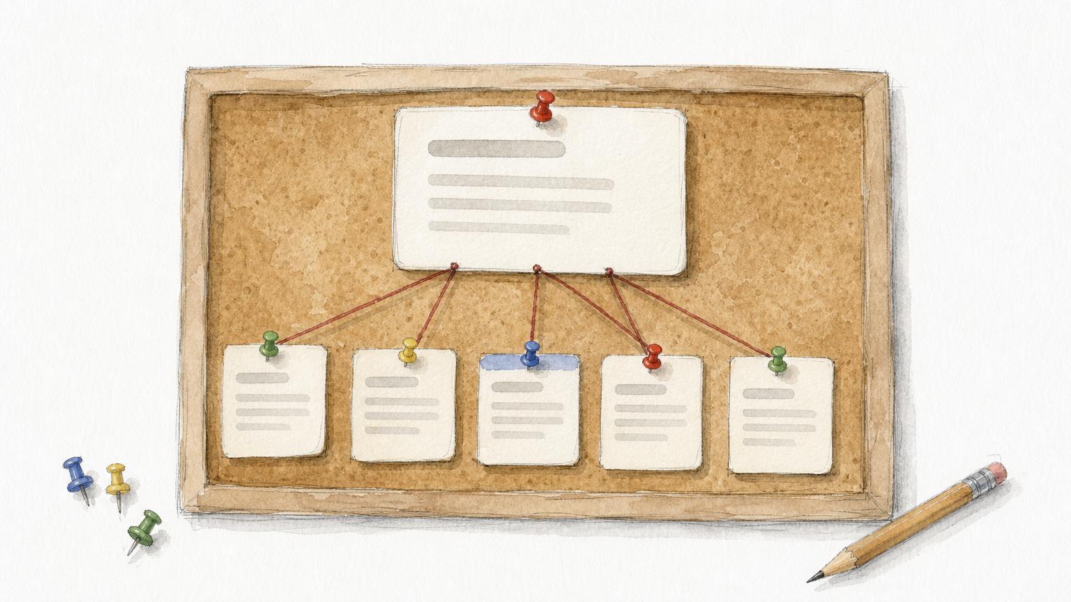
Give each practice area its own page and link them from a simple menu of five to seven items. People search for a specific matter, such as a DUI arrest or a custody dispute, so a page that speaks to that matter matches what they typed. A single page listing every service rarely does.
What to do
Plan the site as a small set of pages, each with one job. This table covers the core set for most firms.
Use your logo as a link to the homepage, keep the menu in the same place on every page, and repeat contact details in the footer.
Mistake to avoid
Two patterns hurt most. One is a long menu with twelve items, which forces a worried visitor to decide where to click. The other is a set of thin practice pages that copy the same text and swap only the matter name.
Write each practice page as if it were the only page the visitor will read. Explain the process, the first steps they should take and what happens when they call you.
One page per matter type, one job per page, and a menu short enough to read at a glance.
5. How short should your intake form be?
Short enough that a stressed person finishes it on a phone. Ask for name, phone number, email, the type of matter and a few lines of description, then collect the rest on the intake call. Every extra field costs completions, and a lead you never receive cannot be signed.
What to do
Treat the form as the start of intake, not a questionnaire. Design the form and the follow-up as one system.
- Keep required fields to what you need to call the person back.
- If you plan to text, add a clear consent checkbox, not pre-checked, that explains what messages they will receive.
- Show an instant confirmation message and send an auto-reply email.
- Alert your intake team the moment a form arrives. The Lead Response Management Study found that leads contacted within five minutes are far more likely to be qualified than those first reached at thirty minutes.
- Give each campaign its own call tracking number so phone-only leads are credited to their source.
GavelGrow's platform provides hosted, embeddable intake forms with a consent audit log, duplicate detection and bot protection. They embed on any website through an iframe or script snippet, and they fire conversion events to your own GA4, Meta Pixel or Tag Manager.
Mistake to avoid
Do not ask for the full story of the case, and never request sensitive identifiers such as a Social Security number on a web form. Another mistake is tracking forms but ignoring calls. Many prospects only ever pick up the phone, and without tracking numbers they look like direct traffic.
A website that counts form fills but not phone calls is measuring half of its leads.
6. Make the site fast and accessible
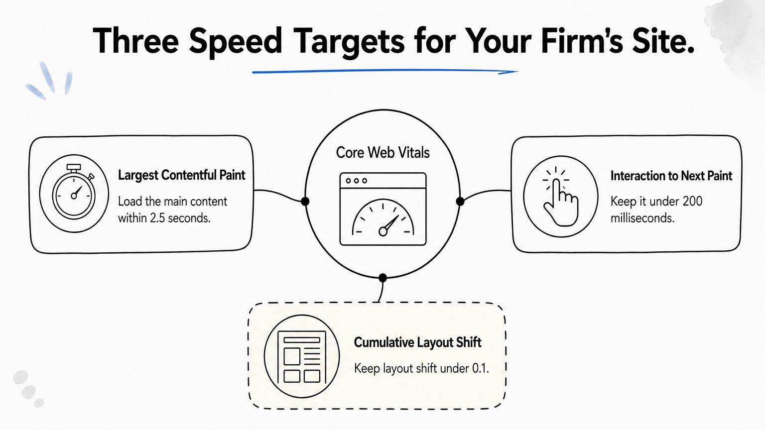
Aim for Google's "good" Core Web Vitals thresholds and meet WCAG 2.1 Level AA basics. Speed keeps visitors from leaving, and accessibility lets everyone use the site, including visitors who rely on screen readers. Both are also easier to build in from the start than to retrofit.
What to do
Google's Core Web Vitals set the targets: Largest Contentful Paint within 2.5 seconds, Interaction to Next Paint under 200 milliseconds, and Cumulative Layout Shift under 0.1. Check your pages for free with PageSpeed Insights. For accessibility, the WCAG guidelines are the reference most audits use.
- Compress images, lazy-load those below the first screen, and avoid autoplay background video.
- Limit third-party scripts such as chat tools and extra trackers.
- Keep text contrast at 4.5:1 or better for body copy.
- Add alt text to meaningful images and labels to every form field.
- Make sure the site works with a keyboard alone, and add captions to video and transcripts to audio.
Mistake to avoid
A heavy hero video is the classic speed killer. It looks impressive in a demo and loads slowly on a phone connection.
Another trap is an accessibility overlay widget sold as a quick fix. A widget does not repair underlying code problems, so build accessibility into design and markup, and ask your counsel how accessibility rules apply to your firm.
Fast pages and accessible code protect every other design choice you make.
Frequently asked questions
What are the 7 C's of website design?
The 7 C's are context, content, community, customization, communication, connection and commerce. They are a general framework, not a legal-marketing rule. For a law firm, context (layout and branding) and content (practice pages and attorney profiles) carry the most weight, followed by communication through phone, form and chat. Commerce only applies if you accept online payments from clients, and community covers reviews and local involvement.
Is a template or website builder good enough for a law firm?
Yes, if it lets you control the parts that drive inquiries. Platforms like WordPress and Wix can produce a professional site, so the platform matters less than three capabilities. You need fast load times, clean mobile layouts and the ability to embed your own intake form. GavelGrow's hosted forms embed through an iframe or script snippet, so they work on most builders without a rebuild.
Do state bar rules apply to your law firm website?
Generally yes. Most states treat a firm website as lawyer advertising, and ABA Model Rule 7.1 prohibits false or misleading communications about a lawyer's services. States add their own rules on testimonials, past results, specialization claims and required disclaimers. Check your state bar's current advertising rules, and avoid superlatives and promises of outcomes. When in doubt, ask your state bar's ethics counsel before you publish.
How do you know whether your website is producing signed cases?
Track the full path from click to retainer. Use a unique call tracking number for each campaign, send form submissions to your own analytics as conversion events, and record the originating source on every case you open. On the Optimize plan, GavelGrow sends signed cases back to Google Ads as offline conversions. Both Track and Optimize include a 7-day free trial with no credit card.
What should you fix first on an existing law firm website?
Start with the first screen, then the mobile phone button, then the intake form. These three changes touch the pages that most visitors see. Run your homepage through PageSpeed Insights, which is free, and fix any failing Core Web Vitals. Then call your own tracking number from a phone to confirm it rings your intake team and is credited to the right source.
Where to start on your redesign
Good law firm website design is a short list of habits. State clearly what you handle, make calling easy on a phone, show credibility with checkable facts, organize pages around the matters clients search for, keep the intake form short and keep the site fast and accessible. If you can only change one thing this month, rewrite your first screen and test the phone button.
A redesign only pays off if you can see which visitors become signed cases. If you want help with forms, landing pages and call handling, GavelGrow's conversion optimization service works on exactly those pieces for law firms.
Frequently Asked Questions
What are the 7 C's of website design?
The 7 C's are context, content, community, customization, communication, connection and commerce. They are a general framework, not a legal-marketing rule. For a law firm, context (layout and branding) and content (practice pages and attorney profiles) carry the most weight, followed by communication through phone, form and chat. Commerce only applies if you accept online payments from clients, and community covers reviews and local involvement.
Is a template or website builder good enough for a law firm?
Yes, if it lets you control the parts that drive inquiries. Platforms like WordPress and Wix can produce a professional site, so the platform matters less than three capabilities. You need fast load times, clean mobile layouts and the ability to embed your own intake form. GavelGrow's hosted forms embed through an iframe or script snippet, so they work on most builders without a rebuild.
Do state bar rules apply to your law firm website?
Generally yes. Most states treat a firm website as lawyer advertising, and ABA Model Rule 7.1 prohibits false or misleading communications about a lawyer's services. States add their own rules on testimonials, past results, specialization claims and required disclaimers. Check your state bar's current advertising rules, and avoid superlatives and promises of outcomes. When in doubt, ask your state bar's ethics counsel before you publish.
How do you know whether your website is producing signed cases?
Track the full path from click to retainer. Use a unique call tracking number for each campaign, send form submissions to your own analytics as conversion events, and record the originating source on every case you open. On the Optimize plan, GavelGrow sends signed cases back to Google Ads as offline conversions. Both Track and Optimize include a 7-day free trial with no credit card.
What should you fix first on an existing law firm website?
Start with the first screen, then the mobile phone button, then the intake form. These three changes touch the pages that most visitors see. Run your homepage through PageSpeed Insights, which is free, and fix any failing Core Web Vitals. Then call your own tracking number from a phone to confirm it rings your intake team and is credited to the right source.